Update Jun 9, 2013: Daniel Pasco will be joining the Breakpoints on trumpet and guitar!
I’m excited to announce that James Dempsey and the Breakpoints will be performing Live Near WWDC 2013 on Wednesday, June 12th at 7:00 PM.
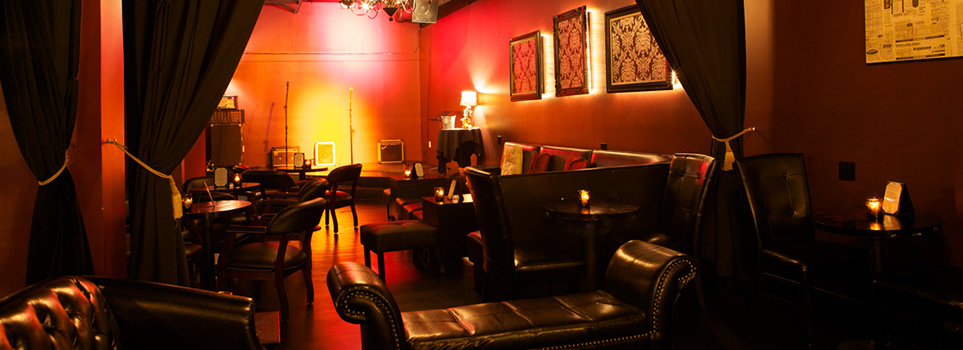
The show is just a few blocks from Moscone West at 50 Mason Social House. Admission is free—no cover charge and no ticket required. We provide the music, you buy the drinks.
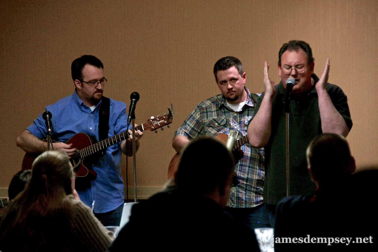
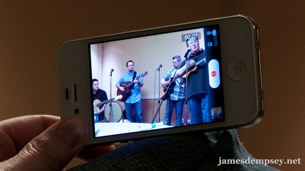
Join fellow iOS and Mac developers for an evening of humorous and informative songs including favorites such as Hold Me, Use Me, Release Me; I Love View and Model View Controller. And don’t miss the live performance of our latest single, that modern tale of momentary loss and redemption, Almost Dropped My iPhone.
The joint will be jumpin’ at 50 Mason
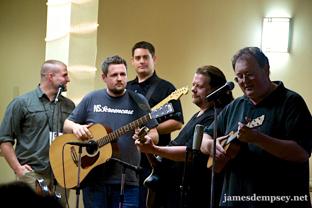
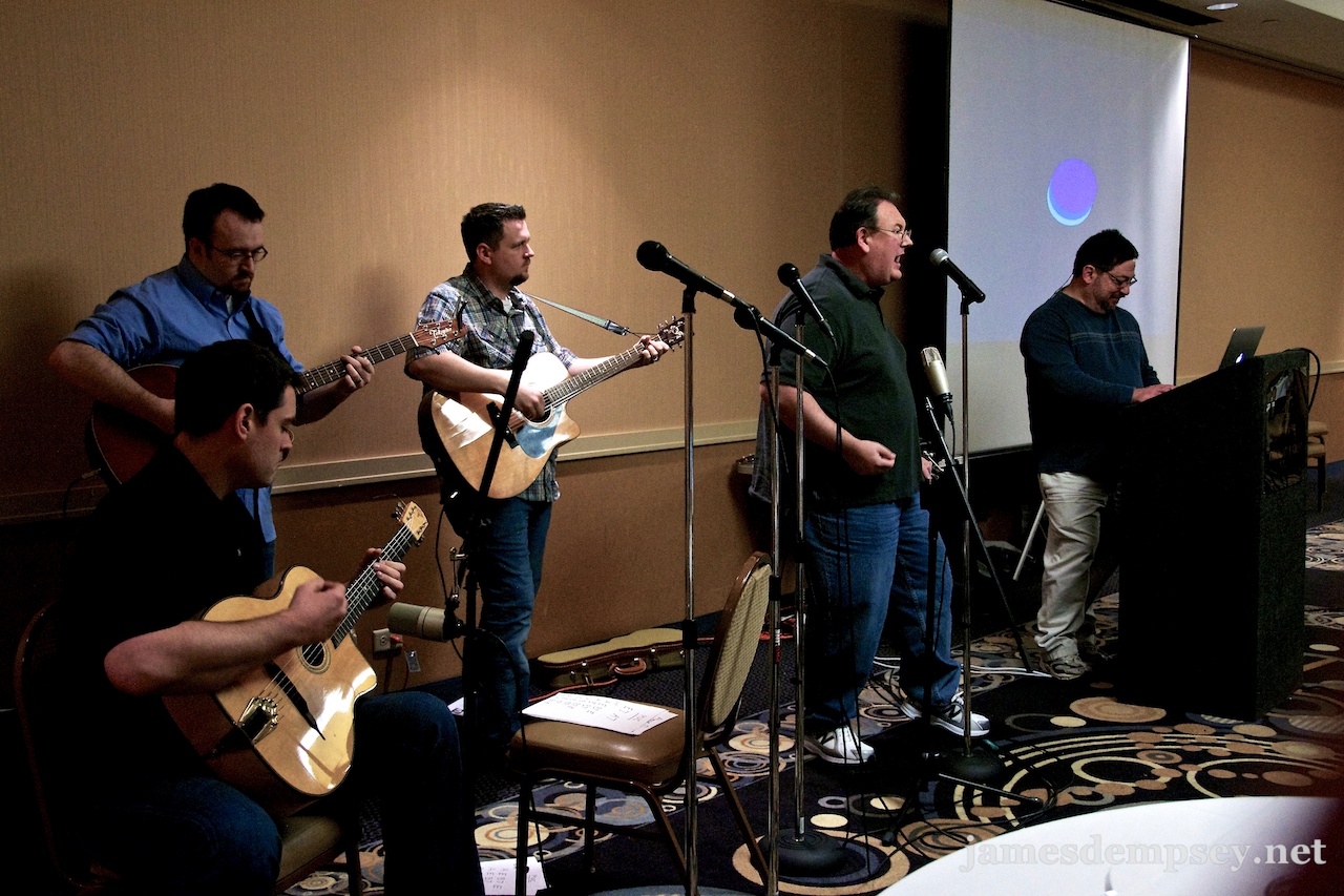
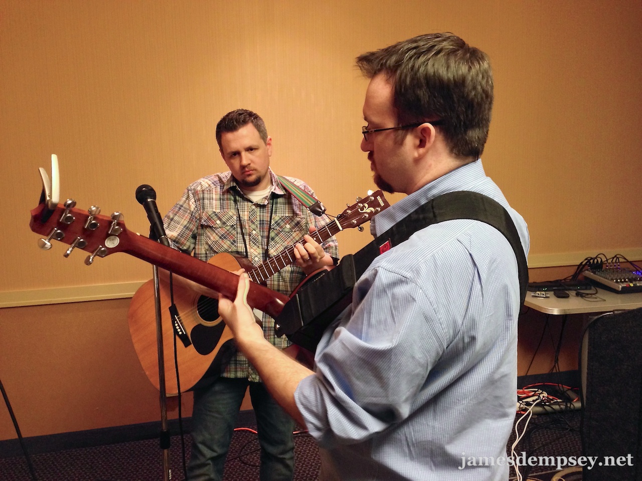
Night Of A Thousand Breakpoints
(Well… at least five or six)
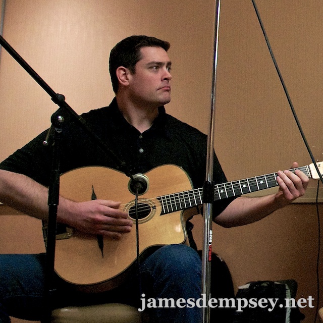
This year, the show features a lineup of Mac and iOS indie developer luminaries and maybe even a special guest or two. The Breakpoints include:
They will be joined by the incomparable Victor Alexander (@victoralexander) on slide-advance keyboard.
No WWDC Ticket Required
The show is open to all—no WWDC ticket required—making it a great event for all developers in town for the week. There’s not even an NDA, so tell your friends and come on out to James Dempsey and the Breakpoints, Live Near WWDC 2013. •
For show updates and James Dempsey and the Breakpoints news: Sign up for the band newsletter. Follow @jamesdempsey on Twitter. 50 Mason Social House
50 Mason Street
San Francisco, CA 94102
(415) 433-5050
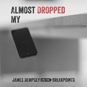
Almost Dropped My iPhone, the second single by James Dempsey and the Breakpoints_,_ is now available in worldwide release on iTunes.
Inspired by actual events, Almost Dropped My iPhone captures the full emotional range of this modern tale of momentary loss and redemption.
Listen to an iTunes preview of this fun song that gives voice to an experience shared by millions of people around the world.
Here’s what people are saying about Almost Dropped My iPhone:
“★★★★★ – Fun song about that instant of observed panic when your digital life flashes before your eyes. Encompasses coffeehouse acoustic folk to barroom guitar licks in just under 3 minutes. Go ahead, give it a try. It’ll put a smile on your face, and you might catch yourself humming it later.”
– Common Rob
“★★★★★ – Who among us hasn’t been there? James Dempsey and the Breakpoints capture the moment beautifully, with the musical playfulness we’ve come to expect. A great and worthy addition to your Breakpoints collection!”
– illium
 Download event to your calendar.