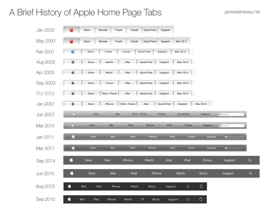
Apple Home Page Tabs History—September 2015 Edition
September 29, 2015
The year 2015 has been a busy one in Apple Home Page Tab history.
It’s been over a decade since there have been this many changes to Apple home page tabs in a single year.
The only other time Apple home page tabs changed three times in a calendar year was back in 2003.
All three of the home page tab changes that year revolved around the introduction of the iTunes Music Store. The Switch tab for the Mac Switcher ad campaign changed to Music with the introduction of iTMS in April 2003. This lasted five months when iTunes replaced Music. This lasted only a month when the tab became iPod + iTunes.
There were no visual style changes to the tabs in 2003, just repeated content changes to that single tab as Apple adjusted how it presented its new foray into digital music to the world.
The changes of 2003 came full circle this past June, when the iTunes and iPod tabs combined to become a Music tab with the introduction of the new Apple Music service—but even bigger changes were right around the corner.
August 2015: Store to Shopping Bag
In August 2015, a redesigned apple.com combined the shopping experience of store.apple.com with the product information found on the main Apple site.
With the online store no longer a standalone site, the venerable Store tab—a fixture in the Apple home page tab lineup since the very beginning—had outlived its usefulness.

Shopping Bag is the first tab to show state.
For its entire tenure, the Store tab was the constant companion of the Apple tab, its steady commerce-oriented neighbor to the right.
The new Shopping Bag tab is the logical successor to the Store tab, but it is not its replacement in either location or behavior. 1
The Apple and Shopping Bag tabs are now the first and last items serving as bookends for the rest of the home page tabs.
In terms of behavior, clicking the Shopping __Bag tab displays a menu of shopping-related choices, similar to the ‘shopping cart’ on most e-commerce sites. It is the first Apple home page tab to indicate state, showing a blue dot if the user has items in their bag. 2
A New, Responsive Design
The updated apple.com also included visual and functional changes site-wide and to the tab bar in particular.
The tab bar became translucent black with underlying page content visible beneath, a refinement to the visual style introduced in September 2014. 3
The updated website design is also responsive, with the tab bar changing appearance based on page width. For a width 768 and above, the tab bar shows all of its tabs.

The responsive design hides most tabs and adds a menu tab when viewed at narrow widths.
For narrower widths, only three items are visible. The Apple tab appears in the center. The Shopping Bag tab is on the right edge. A new menu tab is on the left edge. All other tabs are presented as menu items displayed by clicking or tapping this new tab.
In the narrow layout there are other minor changes—the tab bar becomes slightly taller and the Apple and Shopping Bag icons slightly larger.
September 2015: TV no longer a hobby
In September 2015, Apple announced the fourth generation Apple TV with Siri Remote and a tvOS SDK for developers to create apps for the new device. Along with that announcement, a new TV tab was added.
This tab was a long time coming. Apple TV was first announced under its code name iTV nine years prior, in the fall of 2006. For many years, Apple referred to Apple TV as a ‘hobby’, indicating that it was not a core product such as Mac or iPhone. History indicates that hobbies do not warrant a tab on the Apple home page.
So, with the announcement of the new Apple TV and the addition of the TV tab, it seems TV is no longer a hobby for Apple. •
Since the last update, I’ve been cited as the ‘unofficial Apple home page tabs historian’ in articles at The Loop and Six Colors. Here are a few past articles on this topic that you might enjoy:
1 The name Bag was the label Apple originally used in the tab’s web accessibility ‘aria-label’ tag. As of September 29, 2015, this appears to have changed to Shopping Bag. ⏎
2 Some earlier tab bar designs would indicate selection state, darkening to indicate which section of the site you were visiting. The shopping bag is the first tab that carries state or status independent of selection. ⏎
3 The images used in the A Brief History of Apple Home Page Tabs graphic are screen captures of the tab bar over a white background ⏎
Category: Apple
