A Brief Visual History of Apple Home Page Tabs
September 10, 2014
This week brought announcements of new iPhones, Apple Pay, and Apple Watch, as well as the quiet departure of the iPod classic, the last remaining click-wheel product in the iPod lineup. It also brought something that happens much less often than new product announcements—changes to the look and lineup of tabs at the top of the page at apple.com.
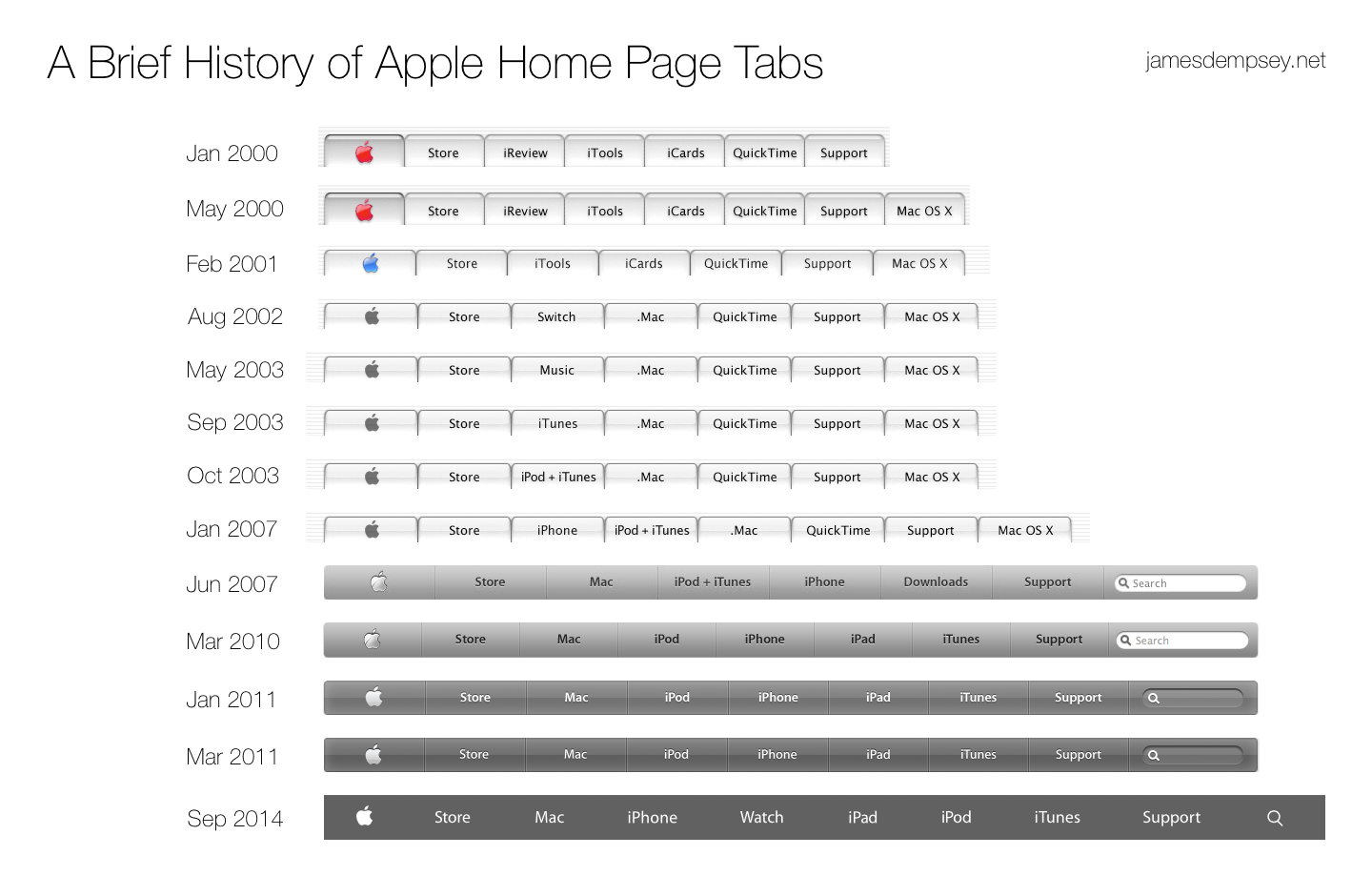
We can see a few different things by looking at how these have changed over the last fourteen years.

First, we see how the user interface has evolved. The tabs begin with the natty pinstripes and bubblicious tabs of the original Aqua interface, appearing on the home page immediately after Aqua was introduced in January 2000. This was the first production use of Aqua elements by Apple—the release of Mac OS X, 10.0 was over a year away. Through the next fourteen years, we see the designs become simpler as the candy look becomes more subtle before disappearing entirely. With the removal of dividing lines between items, the original tabs have finally morphed into a simple menu bar.
This week’s update also ended the reign of Lucida Grande as the font of choice—the honor now belongs to the Apple variant of Myriad.
The content of the tabs shows an interesting progression as well. The Apple logo, Store, and Support tabs are a common thread throughout with Search appearing surprisingly late in the game in 2007. These unchanging outer items are like bookends around the changing world of Apple over time.
For the first seven years, the inner tabs mainly focused on software (QuickTime, Mac OS X, iTunes) and different incarnations of online services (iReview, iCards, iTools which became .Mac). The first hardware to appear on a tab was iPod, but it had to share a tab with iTunes for almost seven years before getting a tab of its own.
With the release of the iPhone in 2007, the tabs became more hardware-centric, with Mac and iPhone getting their own tabs. With the introduction of the iPad in early 2010, the center of the tabs became all hardware lines, with the exception of iTunes (both software and a service).
And, of course, this week Watch joins the lineup. It seems a little odd not to use the full product name Apple Watch or Watch, especially since Watch is both a noun and a verb.
Although the appearance and focus of the tabs have changed over time, it is interesting to note that almost all tabs name something that has been an enduring part of the Apple ecosystem (the exceptions being iReview, iCards, and the Switch campaign). Details may have changed—iTools begat .Mac begat MobileMe begat iCloud, Mac OS X is now OS X—but there are some very consistent through lines. Here’s hoping the Apple Watch is one of those through lines for a long time to come.•
I used the Internet Wayback Machine to help track these changes down. If I’ve missed any changes, please feel free to let me know!
Category: Apple